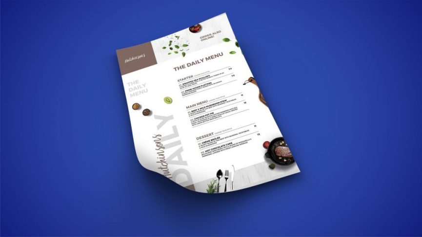
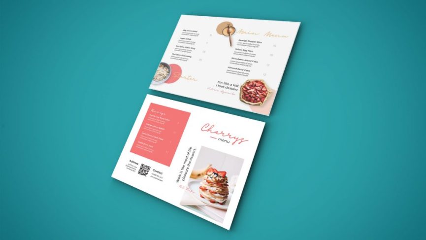
If there was a place you could market yourself knowing that practically 100% of your customers would see it, you’d surely be taking advantage of it in a hot minute. Sure, there’s your posters, flyers, social media posts and the rest of it, but none of them interact with your customers in the same way as your trusty menu.
With that in mind, maybe it’s time to optimise your menu to not only look great but to also convert as many highly profitable sales as possible. Here are some tips we’ve put together to get your menu ahead of the game.
How much is too much?
Before you even get into planning the appearance and structure of your menu, you’ve got to note all the dishes you are going to display on the menu and separate them into their particular categories (e.g. Appetizers, Mains, Drinks, etc.). You’ve got to bare in mind however, that packing everything onto a single menu may cause more harm than good. When customers are bombarded with dish after dish, they can be caught in something called the “Paradox of Choice” where decision making is difficult because there are too many options. In this case, less may be more and you should look to streamline your menu to the most essential and profitable products.
A science-based layout
Next thing you need to consider is how your information will be structured on the page.
It has long been believed that there is a “sweet spot” on a menu that is located at the top right corner, which has led to many highlighted products being showcased in that area. However, more current findings suggest that customers actually read a menu sequentially (like a novel). That means starting from the top left and making their way down the page, as seen below.
![]()
Considering that the eyes tests show that the top right sections of a menu are screened twice on average, the sweet spot may still exist in that area.
Descriptions that make your food to die for.
This is the part where you sell your products, so you’ve gotta make sure you nail it. Your descriptions should entice your customers’ senses & judgement to sell them on your dish before they have a chance to look at the price (more on that later). Use words that ignite their hunger like succulent, indulgent, smokey, crispy to really build up the value proposition and also get their mouths watering. It has also been found that longer descriptions result in more sales. The reason being, the more information a customer knows about a product, the less they need to wonder and contemplate about whether they want it.
We’ve all got fond memories of nostalgic events and feelings, and you can also draw upon this when describing your products. By using phrases like “home-made” or “mum’s special recipe”, it can draw on delightful past experiences that customers might be missing or craving, and can therefore encourage them to revisit their past through your cleverly named dish.
Give your pricing the Where’s Wally treatment.

You want to draw as much attention away from your prices as possible, this includes things like avoiding those notorious dotted lines linking the products to the price, large bold fonts and any colouration and outlines that make it stand out. Price is perceived as a pain point by customers and is therefore a deterrent for purchasing decisions. You can minimise this by creating a powerful description (as mentioned previously) and then subtly slipping in the price right at the end. This way, there is a higher likelihood that they are sold on the item before they even get to the price, making it almost irrelevant.
It is also recommended that you ditch those dollar signs that so often partner the numbers. Dollar signs can bring negative connotations (Making payment is essentially losing something of value), and therefore should be avoided to ensure the whole process involves less friction points.
Now that you’re a master of subtlety, it’s time to perfect the “decoy”.
Otherwise known as price anchoring, this is widely used to temper your customer’s expectations of the value and price of your products. This involves placing some of your more expensive products in plain site or at the very top of the menu so that as they make their way through, everything else that is priced lower will have a higher value proposition and be seen as more affordable.
Wait so do I use a lot of pictures or none… or some?

This is quite a common question and each option will tend to have its fair share of advocates. General rule of thumb suggests that there should be one image per category, so that the menu isn’t cluttered with information, and attention can be drawn to your target sections. Many high-end restaurants tend to go with no imagery, and instead leave it to the customer’s imagination to picture their desired dishes. It is all about gauging your customers and what they are most receptive to, but if you are unsure, one per category is a good place to start.
Stay on brand and draw attention to the right places.
Lastly, make sure your menu conveys the same message and feel that your hospitality business showcases. That is, using a consistent font that is associated with your brand, using the same colour scheme that also closely relates to the products you offer, and writing in a way that – when read out loud – will sound like how you would normally converse with your customers.
If there are particular products or offers you would like to highlight, it is highly effective to use shaded boxes, different colours, arrows or pointers to bring it to their attention. Products that are most popular or generate the highest profit margins tend to be good areas to highlight on your menu.
Take a look at your own menu and see whether or not there are areas that you could improve. Even the smallest adjustments could make a world of difference to how your customers order. If you do implement some of these changes, we’d love to hear about it. Shoot us a message below and tell us what results you were able to generate.
